Velotheek: A Bike Renting Platform For Schools
The brief
When taking their students on excursion, the primary and secondary schools in the city of Brussels regularly have a shortage of bikes. This makes organizing an outing cumbersome. Not all city kids have bikes, because they are too expensive, or because they get stolen too often, etc.
But both communes realized quickly that the reservations of the bikes would become complicated and time consuming for the people in charge. So they turned to me to come up with a more .
Step 1: Research

I visited both Velotheek locations, and talked with all the people involved. Although the premise is comparable at the different communes, there were a lot of differences in the booking flow. The two biggest differences were:
At Velotheek 1, a padlock opened the door of the Velotheek, and could be opened by anyone who had the access code. At Velotheek 2, they used a key, so the user had to check in with someone from the organisation to open up the Velotheek.
In Velotheek 1, you could only book bikes for one day, not multiple days. At Velotheek 2, multiple days were possible, but not more than 10.
These two differences seemed to have a big impact on the flow of the application, and how the user would interact with it. To map out all the different user flows, I started working on persona’s and corresponding jobs to be done.< After the research I defined these persona's:
- The teacher
- The responsible for administration in the school
- The Bike Fixer (someone of Pro Velo) T- he Administrator (someone of the commune)
Every "persona" gets it's own "jobs to be done", mapping of needs and potential risks involved. From that list I defined what jobs we needed to tackle in the first iteration of the project. In this phase I also performed desk research, looking into existing applications, or comparable sharing platforms.
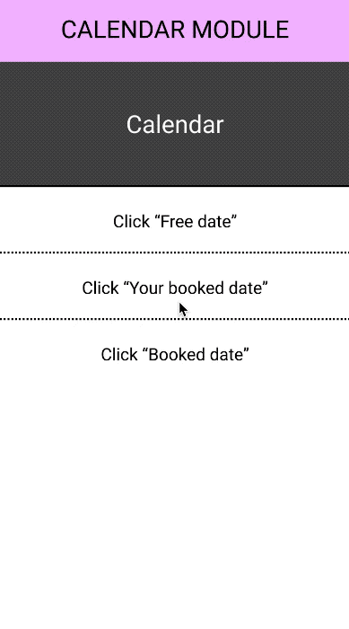
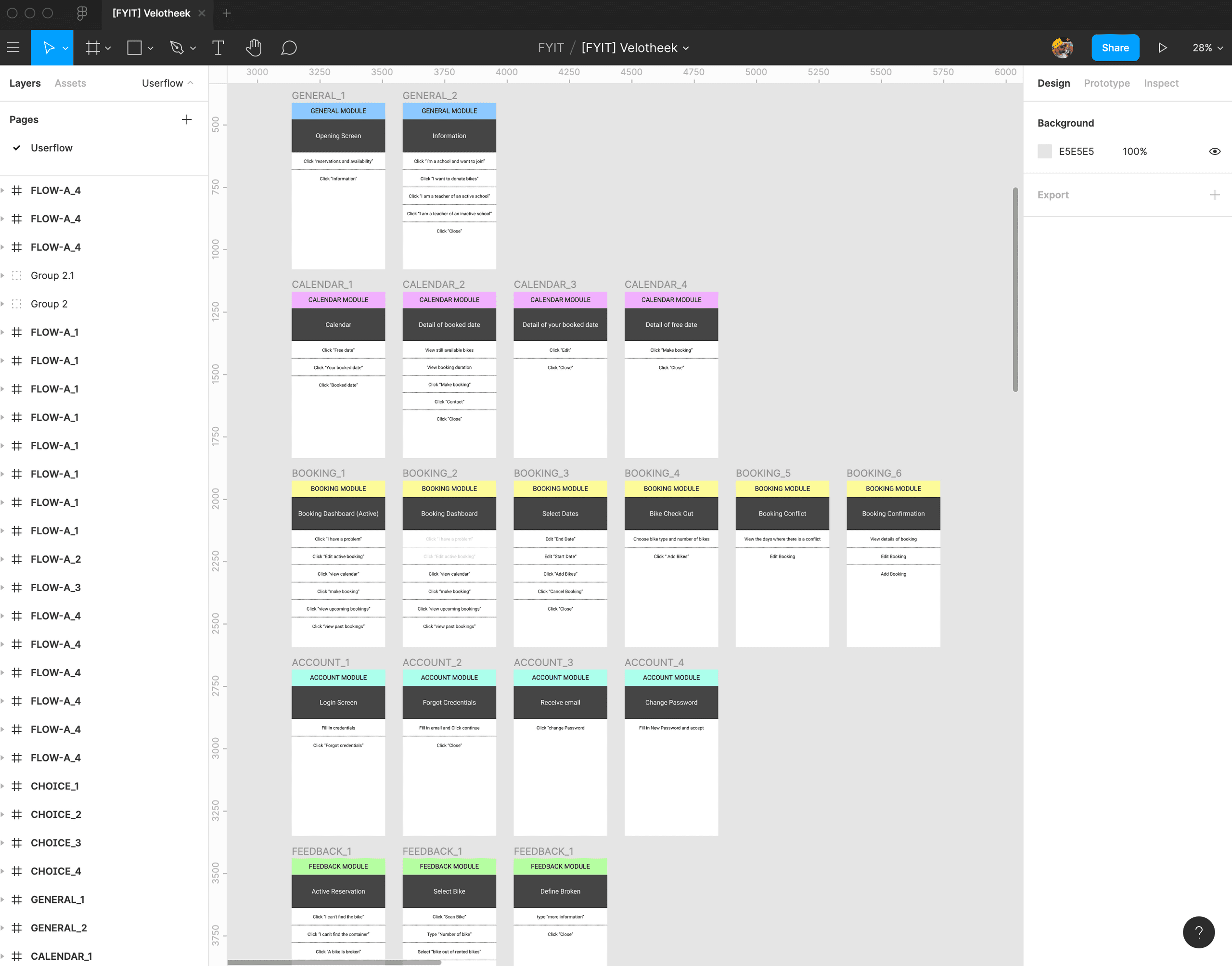
Step 2: Decision Tree

I don't actually know what this exercise is called, but either way, it's a very helpful one. I map out all the steps a user needs to take to get the job done. Every screen has three sections:
- The module: This is not really necessary, but already sets up how I will think about the app when I start coding. It helps to build the app in my mind palace.
- The view: What the user will see.
- The actions: What the user can do on this page.
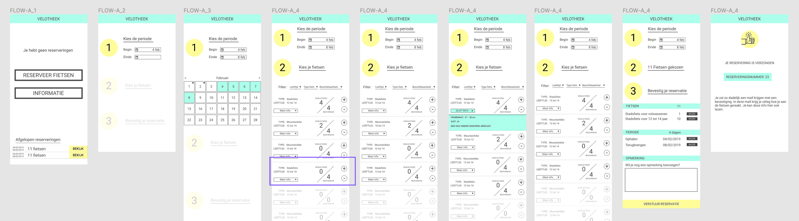
Step 3: Wireframing

Based on the decision tree, I created a wireframe. I always choose a basic design to start with, so the wireframe has some identity to it. This probably goes against some wireframing rules, but I like to give the project immediately a certain vibe, it makes it more fun to play with. The trick is to not get lost in design. To overcome this, I always use the same design system, and limit my "playing around" to mainly the colors.
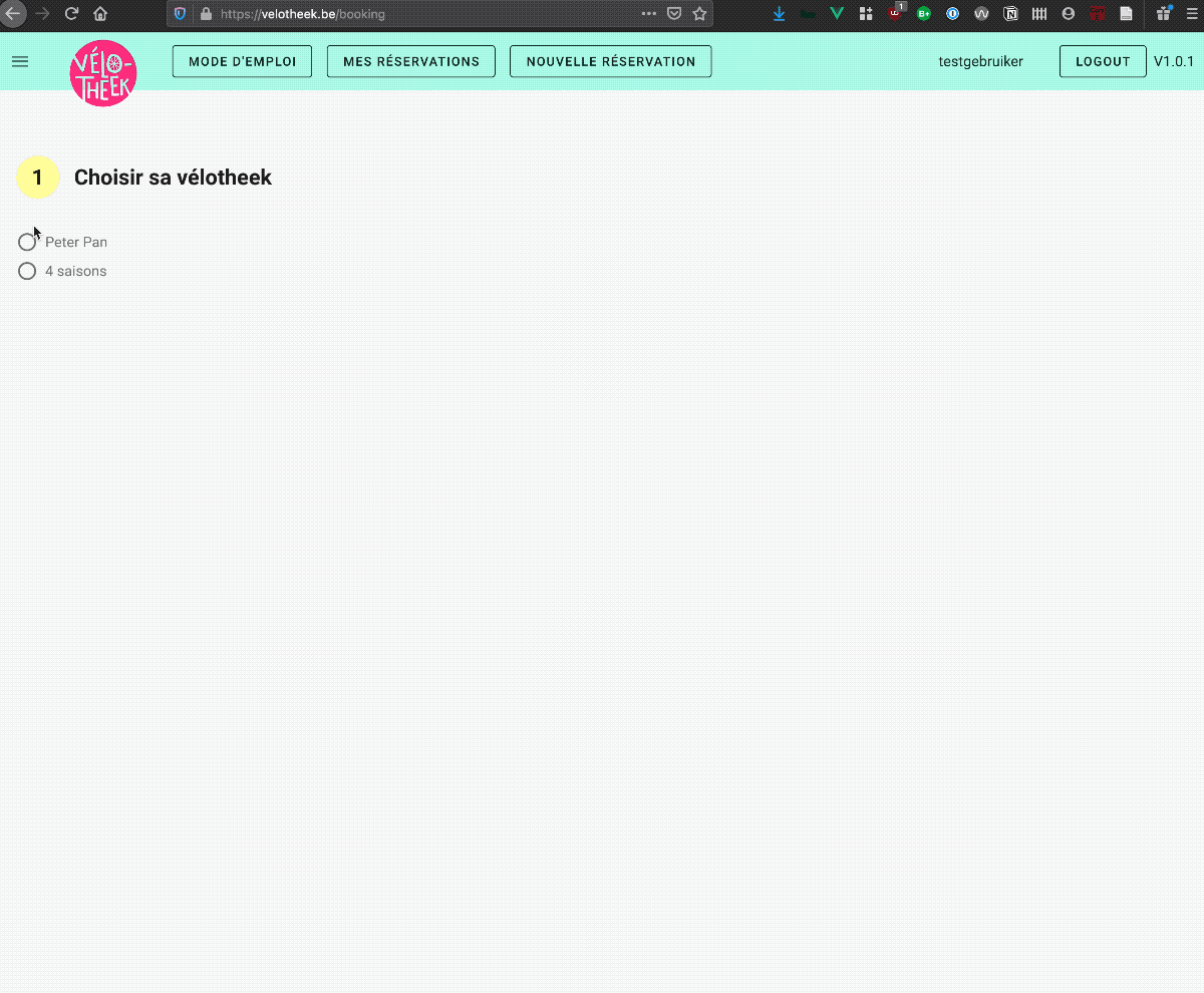
Step 4: Click Prototype

The wireframes get exported to Marvel, a tool specifically for creating click prototypes. It's a bit more robust than the prototyping function of Figma, and makes it easier to share the prototype with a group of users. You could also design the wireframes in Marvel, but I prefer doing this in Figma, so I can keep some continuity in my design files.
Once all the clicks and paths are in place, the app gets send to some users. In this case I've send it to some teachers that were contacted by the commune. It's very valuable to do this in person, as it's easier to catch what the user is doing, but a video call also works. Marvel has been expanding on their remote testing features, so check those out if you plan on doing a remote user session. The lessons I learn during these talks will help me iterate on the wireframes.
Step 5: MVP

Once I have a decent wireframed app, and covered as much as essential use cases, it's time to get the tool in the hands of users. I defined some clear jobs to be done, and develop just enough to accommodate these user flows.
In this case I designed the flow to reserve bikes for one specific day. The app gets send to the same teachers I contacted in step 3, and I asked them to use the app a few times. Using analytics I can check the click paths, and see were the user drops off. All the feedback coming in gets mapped out in Trello.
Step 6: Live beta
I use the lessons of phase 4 to iterate on the code and create a prototype that can be used by a bigger group of people, that can actually be send out to a live audience. At this point I want to start collecting quantitave data, so this is why scale becomes important. Depending how risk averse the client is, this app can be used in a fully live setting, as a beta version. Most important about this phase is the integration of an analytics suite (eg. Google Analytics) , and the possibility for users to easily send feedback.
During this period, I will regularly update the app, introduce new features or kick out existing ones, so the Beta can evolve towards an mature product .